Enhanced ProgressIndicator Styles
Demonstrates all ProgressStyle variants, label positioning, custom borders, and labelFormat callbacks.
- Preview
- Code
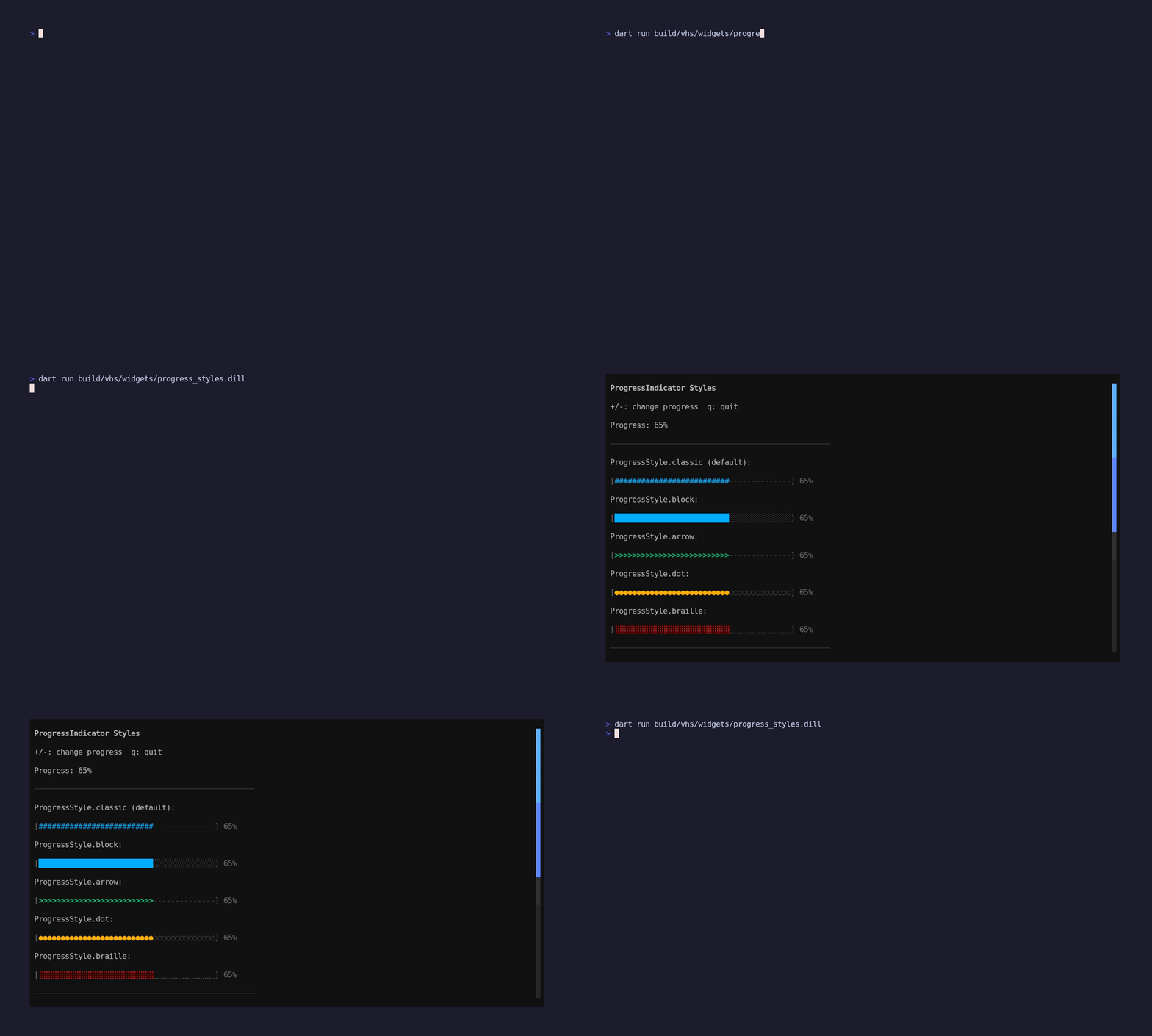
pkgs/artisanal_widgets/example/progress_styles/main.dart
// Enhanced ProgressIndicator Styles Example
import 'package:artisanal_widgets/artisanal_widgets.dart';
//
// Demonstrates all ProgressStyle variants, label positioning,
// custom borders, and labelFormat callbacks.
//
// Run with: dart run example/progress_styles/main.dart
import 'package:artisanal/style.dart' hide Padding, Align;
import 'package:artisanal/tui.dart' as tui;
import 'package:artisanal_widgets/widgets.dart' as w;
void main() async {
final app = WidgetApp(ProgressStylesExample());
await tui.runProgram(
app,
options: const tui.ProgramOptions(
altScreen: true,
mouse: true,
mouseMode: tui.MouseMode.allMotion,
),
);
}
class ProgressStylesExample extends w.StatefulWidget {
ProgressStylesExample({super.key});
w.State createState() => _ProgressStylesExampleState();
}
class _ProgressStylesExampleState extends w.State<ProgressStylesExample> {
final w.WidgetScrollController _scrollController = w.WidgetScrollController();
double _progress = 0.65;
w.Widget build(w.BuildContext context) {
final theme = widget.theme;
final label = theme.labelSmall.copy()..foreground(theme.onBackground);
return w.Container(
padding: const w.EdgeInsets.all(1),
color: theme.background,
child: w.Scrollbar(
controller: _scrollController,
thickness: 1,
gap: 1,
enableHover: true,
trackChar: ' ',
thumbChar: ' ',
trackUsesBackground: true,
thumbUsesBackground: true,
trackGradient: w.ScrollbarGradient.background(
start: w.hasDarkBackground
? const BasicColor('#2f363d')
: const BasicColor('#e3e7eb'),
end: w.hasDarkBackground
? const BasicColor('#1f252a')
: const BasicColor('#d3d9e0'),
),
thumbGradient: w.ScrollbarGradient.background(
start: w.hasDarkBackground
? const BasicColor('#3fb2ff')
: const BasicColor('#2f7df6'),
end: w.hasDarkBackground
? const BasicColor('#7c5cff')
: const BasicColor('#6e55f5'),
),
hoverThumbGradient: w.ScrollbarGradient.background(
start: w.hasDarkBackground
? const BasicColor('#79ddff')
: const BasicColor('#4f93ff'),
end: w.hasDarkBackground
? const BasicColor('#b18bff')
: const BasicColor('#836bff'),
),
hoverThumbChar: ' ',
child: w.ScrollView(
controller: _scrollController,
handleKeys: true,
child: w.Column(
gap: 1,
children: [
w.Text('ProgressIndicator Styles', style: theme.titleLarge),
w.Text('+/-: change progress q: quit', style: label),
w.Text('Progress: ${(_progress * 100).round()}%', style: label),
w.Divider(width: 50),
// All five styles
w.Text('ProgressStyle.classic (default):', style: label),
w.ProgressIndicator(
value: _progress,
showLabel: true,
width: 40,
progressStyle: w.ProgressStyle.classic,
),
w.Text('ProgressStyle.block:', style: label),
w.ProgressIndicator(
value: _progress,
showLabel: true,
width: 40,
progressStyle: w.ProgressStyle.block,
color: theme.primary,
),
w.Text('ProgressStyle.arrow:', style: label),
w.ProgressIndicator(
value: _progress,
showLabel: true,
width: 40,
progressStyle: w.ProgressStyle.arrow,
color: theme.success,
),
w.Text('ProgressStyle.dot:', style: label),
w.ProgressIndicator(
value: _progress,
showLabel: true,
width: 40,
progressStyle: w.ProgressStyle.dot,
color: theme.warning,
),
w.Text('ProgressStyle.braille:', style: label),
w.ProgressIndicator(
value: _progress,
showLabel: true,
width: 40,
progressStyle: w.ProgressStyle.braille,
color: theme.error,
),
w.Divider(width: 50),
// Label positioning
w.Text('ProgressLabelPosition.left:', style: label),
w.ProgressIndicator(
value: _progress,
showLabel: true,
width: 40,
labelPosition: w.ProgressLabelPosition.left,
color: theme.primary,
),
// Custom label format
w.Text('Custom labelFormat (x/100):', style: label),
w.ProgressIndicator(
value: _progress,
showLabel: true,
width: 40,
labelFormat: (v) => '${(v * 100).round()}/100',
color: theme.success,
),
w.Divider(width: 50),
// No border
w.Text('showBorder: false:', style: label),
w.ProgressIndicator(
value: _progress,
showLabel: true,
width: 40,
showBorder: false,
progressStyle: w.ProgressStyle.block,
color: theme.primary,
),
// Custom border chars
w.Text('Custom borders (< >):', style: label),
w.ProgressIndicator(
value: _progress,
showLabel: true,
width: 40,
borderLeft: '<',
borderRight: '>',
progressStyle: w.ProgressStyle.arrow,
color: theme.warning,
borderColor: theme.muted,
),
// Custom fill/track chars override style
w.Text('Custom fillChar/trackChar override:', style: label),
w.ProgressIndicator(
value: _progress,
showLabel: true,
width: 40,
fillChar: '=',
trackChar: '.',
color: theme.success,
),
],
),
),
),
);
}
tui.Cmd? handleUpdate(tui.Msg msg) {
if (msg is tui.KeyMsg) {
final key = msg.key;
if (key.char == 'q') return tui.Cmd.quit();
if (key.char == '+' || key.char == '=') {
setState(() {
_progress = (_progress + 0.05).clamp(0.0, 1.0);
});
}
if (key.char == '-') {
setState(() {
_progress = (_progress - 0.05).clamp(0.0, 1.0);
});
}
}
return null;
}
}
Run it
dart run pkgs/artisanal_widgets/example/progress_styles/main.dart