BoxDecoration Showcase
Demonstrates border presets, borderRadius, gradient, and combinations. Cards are laid out with Wrap so they reflow as the terminal is resized.
- Preview
- Code
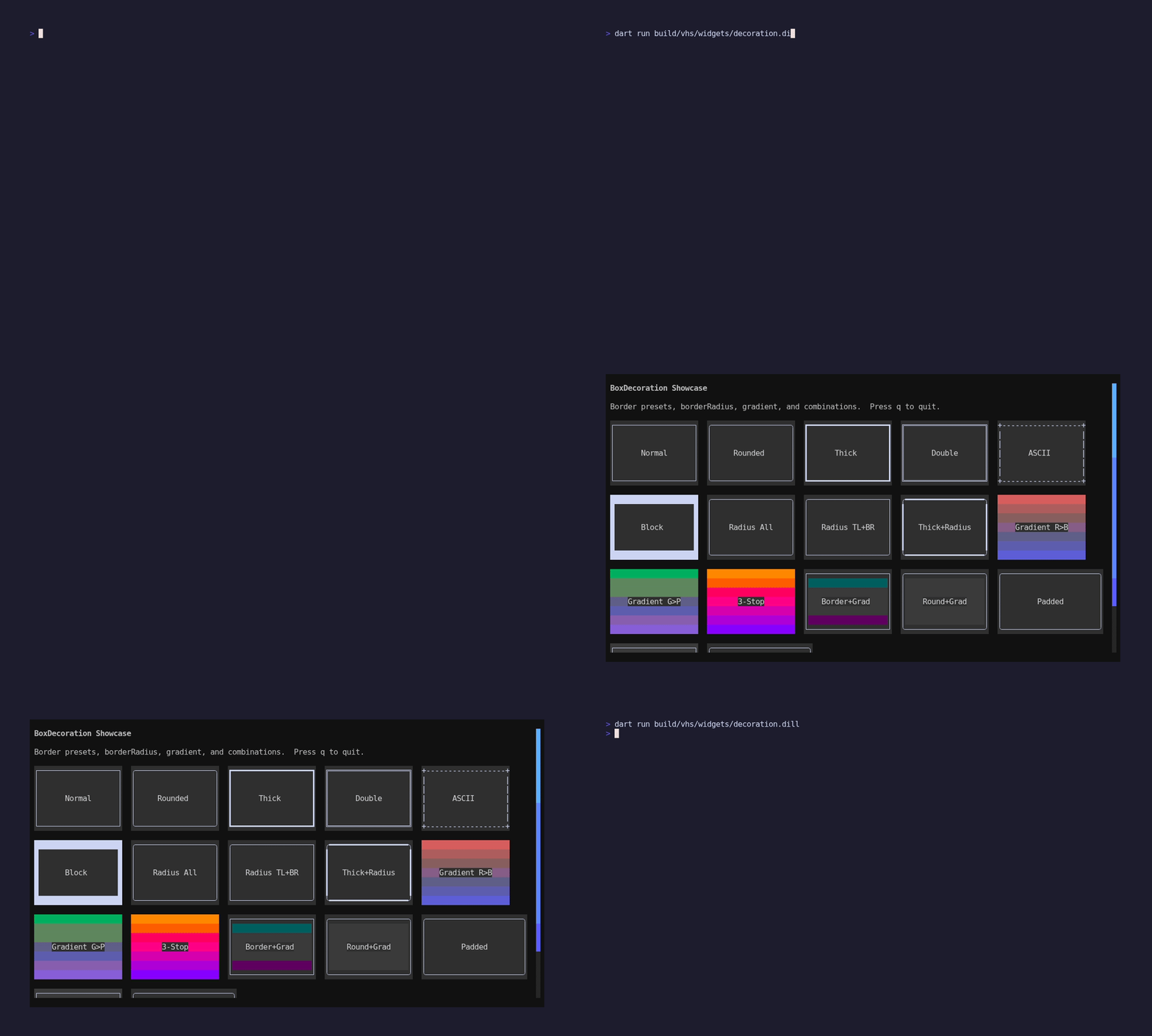
pkgs/artisanal_widgets/example/decoration/main.dart
// BoxDecoration Showcase
import 'package:artisanal_widgets/artisanal_widgets.dart';
//
// Demonstrates border presets, borderRadius, gradient, and combinations.
// Cards are laid out with Wrap so they reflow as the terminal is resized.
//
// Run with: dart run example/decoration/main.dart
import 'package:artisanal/style.dart' hide Padding, Align;
import 'package:artisanal/tui.dart' as tui;
import 'package:artisanal_widgets/widgets.dart' as w;
void main() async {
final app = WidgetApp(DecorationShowcase());
await tui.runProgram(
app,
options: const tui.ProgramOptions(
altScreen: true,
mouse: true,
mouseMode: tui.MouseMode.allMotion,
),
);
}
class DecorationShowcase extends w.StatefulWidget {
DecorationShowcase({super.key});
w.State createState() => _DecorationShowcaseState();
}
class _DecorationShowcaseState extends w.State<DecorationShowcase> {
final w.WidgetScrollController _scrollController = w.WidgetScrollController();
w.Widget build(w.BuildContext context) {
final theme = widget.theme;
final label = theme.labelSmall.copy()..foreground(theme.onBackground);
final isDark = w.hasDarkBackground;
return w.Container(
padding: const w.EdgeInsets.all(1),
color: theme.background,
child: w.Scrollbar(
controller: _scrollController,
thickness: 1,
gap: 1,
enableHover: true,
trackChar: ' ',
thumbChar: ' ',
trackUsesBackground: true,
thumbUsesBackground: true,
trackGradient: w.ScrollbarGradient.background(
start: w.hasDarkBackground
? const BasicColor('#2f363d')
: const BasicColor('#e3e7eb'),
end: w.hasDarkBackground
? const BasicColor('#1f252a')
: const BasicColor('#d3d9e0'),
),
thumbGradient: w.ScrollbarGradient.background(
start: w.hasDarkBackground
? const BasicColor('#3fb2ff')
: const BasicColor('#2f7df6'),
end: w.hasDarkBackground
? const BasicColor('#7c5cff')
: const BasicColor('#6e55f5'),
),
hoverThumbGradient: w.ScrollbarGradient.background(
start: w.hasDarkBackground
? const BasicColor('#79ddff')
: const BasicColor('#4f93ff'),
end: w.hasDarkBackground
? const BasicColor('#b18bff')
: const BasicColor('#836bff'),
),
hoverThumbChar: ' ',
child: w.ScrollView(
controller: _scrollController,
handleKeys: true,
child: w.Column(
gap: 1,
children: [
w.Text('BoxDecoration Showcase', style: theme.titleLarge),
w.Text(
'Border presets, borderRadius, gradient, and combinations. '
'Press q to quit.',
style: label,
),
w.Wrap(
spacing: 2,
runSpacing: 1,
children: [
// -- Border presets --
_card(title: 'Normal', border: Border.normal, theme: theme),
_card(title: 'Rounded', border: Border.rounded, theme: theme),
_card(title: 'Thick', border: Border.thick, theme: theme),
_card(title: 'Double', border: Border.double, theme: theme),
_card(title: 'ASCII', border: Border.ascii, theme: theme),
_card(title: 'Block', border: Border.block, theme: theme),
// -- BorderRadius --
_card(
title: 'Radius All',
border: Border.normal,
borderRadius: const w.BorderRadius.all(1),
theme: theme,
),
_card(
title: 'Radius TL+BR',
border: Border.normal,
borderRadius: const w.BorderRadius.only(
topLeft: 1,
bottomRight: 1,
),
theme: theme,
),
_card(
title: 'Thick+Radius',
border: Border.thick,
borderRadius: const w.BorderRadius.all(1),
theme: theme,
),
// -- Gradient --
_card(
title: 'Gradient R>B',
gradient: w.Gradient([
BasicColor(isDark ? '#cc3333' : '#ff5555'),
BasicColor(isDark ? '#3333cc' : '#5555ff'),
]),
theme: theme,
),
_card(
title: 'Gradient G>P',
gradient: w.Gradient([
BasicColor(isDark ? '#22aa44' : '#44cc66'),
BasicColor(isDark ? '#8833cc' : '#aa55ee'),
]),
theme: theme,
),
_card(
title: '3-Stop',
gradient: w.Gradient([
BasicColor('#ff8800'),
BasicColor('#ff0088'),
BasicColor('#8800ff'),
]),
theme: theme,
),
// -- Border + Gradient --
_card(
title: 'Border+Grad',
border: Border.normal,
gradient: w.Gradient([
BasicColor(isDark ? '#1a3a5c' : '#a8d0f0'),
BasicColor(isDark ? '#5c1a3a' : '#f0a8d0'),
]),
theme: theme,
),
_card(
title: 'Round+Grad',
border: Border.normal,
borderRadius: const w.BorderRadius.all(1),
gradient: w.Gradient([
BasicColor(isDark ? '#2c5f2d' : '#97d897'),
BasicColor(isDark ? '#5f2d2c' : '#d89797'),
]),
theme: theme,
),
// -- Border + Padding --
_card(
title: 'Padded',
border: Border.rounded,
padding: const w.EdgeInsets.all(1),
theme: theme,
width: 24,
),
// -- Border + Color --
_card(
title: 'Colored BG',
border: Border.normal,
bgColor: isDark
? const BasicColor('#2a3a4a')
: const BasicColor('#d8e8f8'),
theme: theme,
),
// -- All combined --
_card(
title: 'All Combined',
border: Border.normal,
borderRadius: const w.BorderRadius.all(1),
gradient: w.Gradient([
BasicColor(isDark ? '#4a1a6a' : '#c8a0e8'),
BasicColor(isDark ? '#1a4a6a' : '#a0c8e8'),
]),
padding: const w.EdgeInsets.symmetric(horizontal: 1),
theme: theme,
width: 24,
),
],
),
],
),
),
),
);
}
w.Widget _card({
required String title,
required w.Theme theme,
Border? border,
w.BorderRadius? borderRadius,
w.Gradient? gradient,
w.EdgeInsets? padding,
Color? bgColor,
int width = 20,
int height = 7,
}) {
final titleStyle = theme.labelSmall.copy()..foreground(theme.onSurface);
return w.Container(
width: width,
height: height,
decoration: w.BoxDecoration(
color: bgColor ?? theme.surface,
border: border,
borderRadius: borderRadius,
gradient: gradient,
),
padding: padding,
alignment: w.Alignment.center,
child: w.Text(title, style: titleStyle),
);
}
tui.Cmd? handleUpdate(tui.Msg msg) {
if (msg is tui.KeyMsg && msg.key.char == 'q') {
return tui.Cmd.quit();
}
return null;
}
}
Run it
dart run pkgs/artisanal_widgets/example/decoration/main.dart